REDESIGNS
A Successful Redesign is NOT About Following Trends
WHY DID WE REDESIGN?
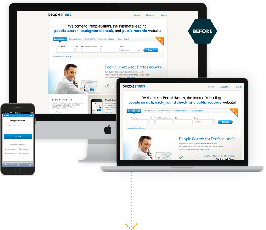
Throughout the life of our product, we got a better understanding of our target demographic groups. We had a very broad customer base that spanned wide ages and career backgrounds. We realigned our products to meet those specific needs.


METHOD / STRATEGY
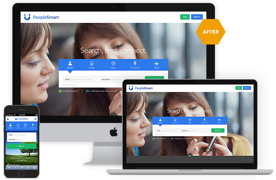
We directed attention to the search by using an impactful image to two women looking towards it. Then we simplified the required inputs to entice people to complete the search. Also, we enhanced the categories of search with easy to identify icons.
•
A friendlier logo and fonts that increase legibility evoke a feeling of comfort and trust.
•
Adding a contrasting primary button color differentiates the main call to action from other actions that might be distracting.
DASHBOARD REDESIGN
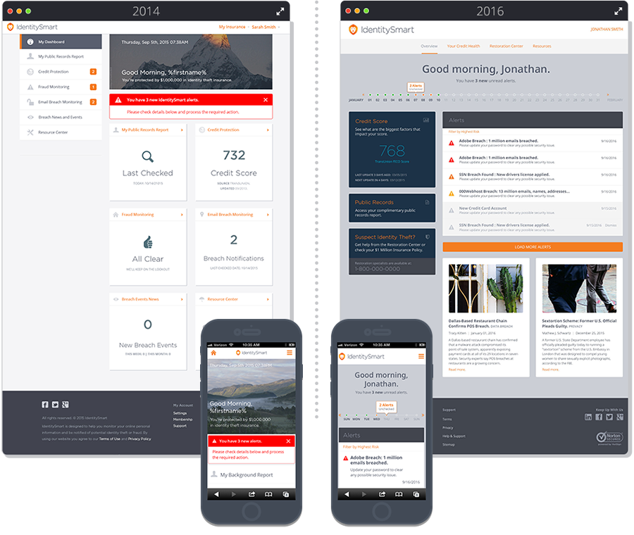
To increase engagement, more relevent content was surfaced with learnings from previous A/B testing. Instead of all sections having equal weight, a clear hierarchy helps users focus on each section one by one.

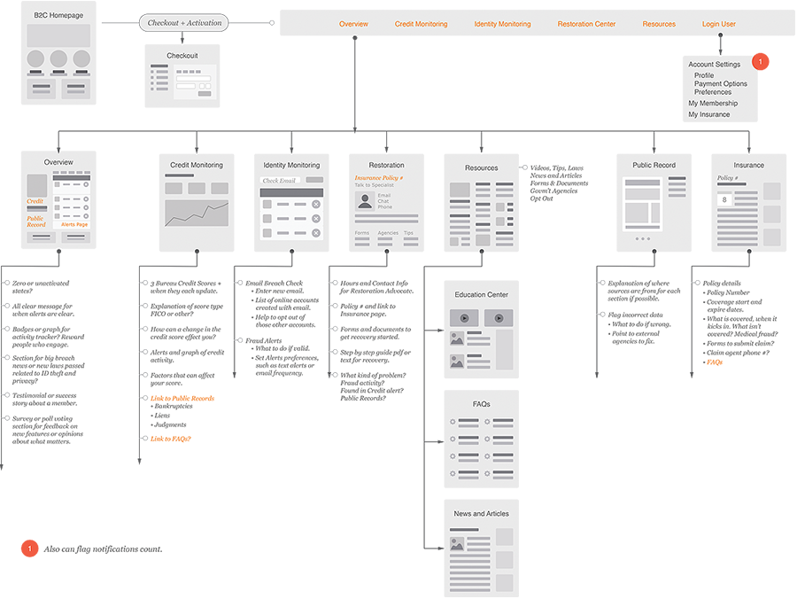
THIS EVEN LEAD TO A NEW SITE STRUCTURE...
By surfacing more content in the dashboard, some unnecessary pages were disposed. The site became easier to navigate and more manageable to maintain.


MY LOCATION
Silicon Valley, California USA