CASE STUDY 3
Introduce In-Product Validation & Statuses

THE CHALLENGE / DISCOVERY
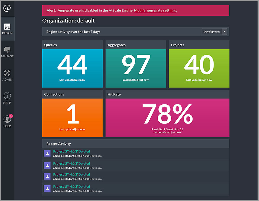
Notifications and alerts are triggered upon logging back into the product. It would appear in the home screen and contain a generic message about various issues throughout the application. These notices would be more actionable if they were closer to the source.
This challenge was discovered and initiated as a priority by the product team (product manager, frontend developer and myself) based on our expertise. Mainly, it is poor user experience to leave users stranded. We always want to offer guidance towards options that let move people forward—especially so when notifying them of a problem. Show them how to address the problem.
Although it is wonderful to have the trust and support of the company to push initiatives like this through, we still want to measure against the experience before and after any changes. This means, we would keep tabs on the number of support tickets (or the reduction thereof) that are entered by users after seeing a new notification or error message is displayed, as well as how many errors are fixed by the users themselves.
CUSTOMER JOURNEY
A user logs into the product from the browser application. At the moment of logging in, the engine does a quick check for any changes or issues that the user should be notified about. The alert appears on the home screen for a few seconds or until clicked.
- The alert usually refers to an issue or object that is not shown on the same screen as the alert message.
- After seeing the alert, the user may want to take action, however, it is not clear where to navigate to in order to fix the issue.
PROCESS
DURATION: APPROXIMATELY 3 MONTHS
This is an example of the home screen after a user has just finished logging into the browser application. A quick check for statuses and issues related to the product triggers an alert message that appears as a banner in the top the page.
WHAT WE CHANGED
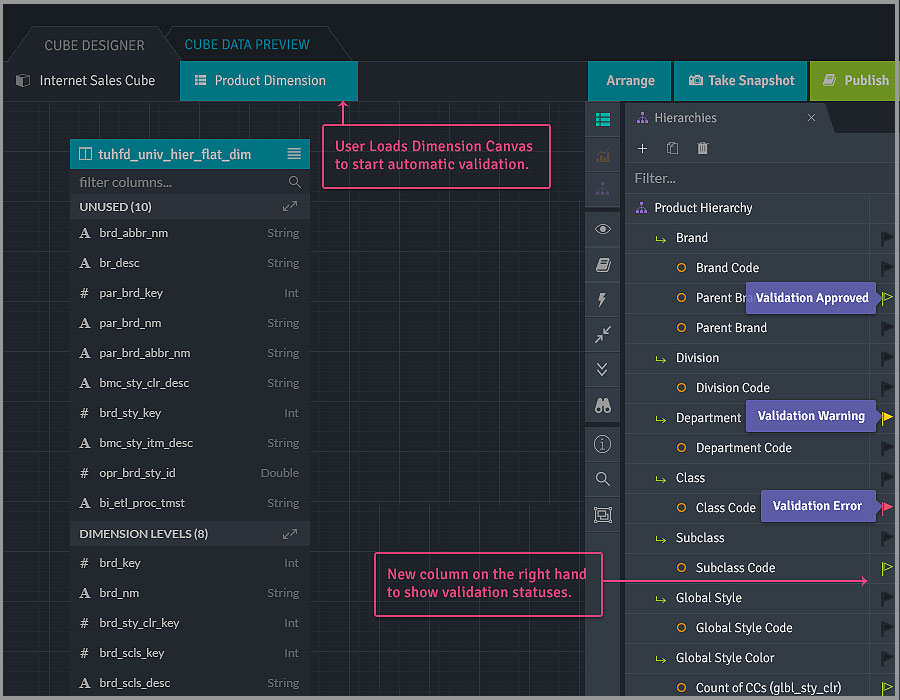
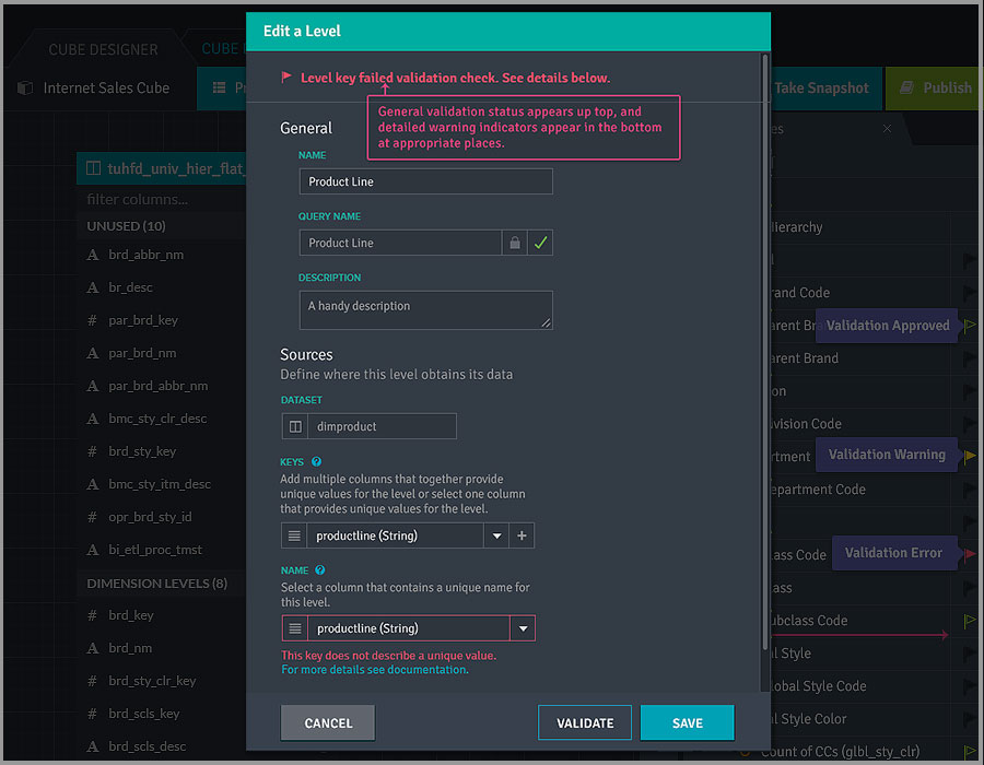
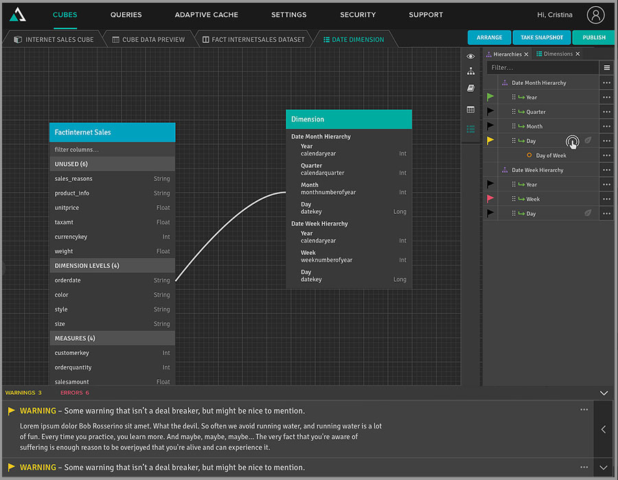
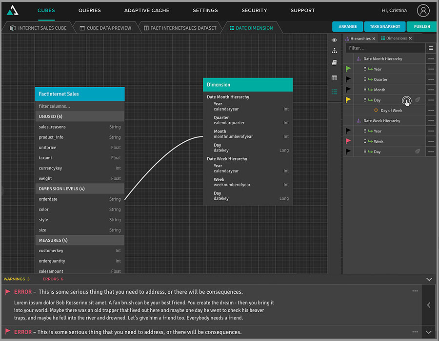
- By bringing statuses and notifications as close as possible to the source, users can understand the context of the alert message. It also allows for direct editting.
- After opening an edit dialog, the nature of the alert is visible at the top. Then, it directs a user to the specific area of the dialog that details which input needs to be fixed.
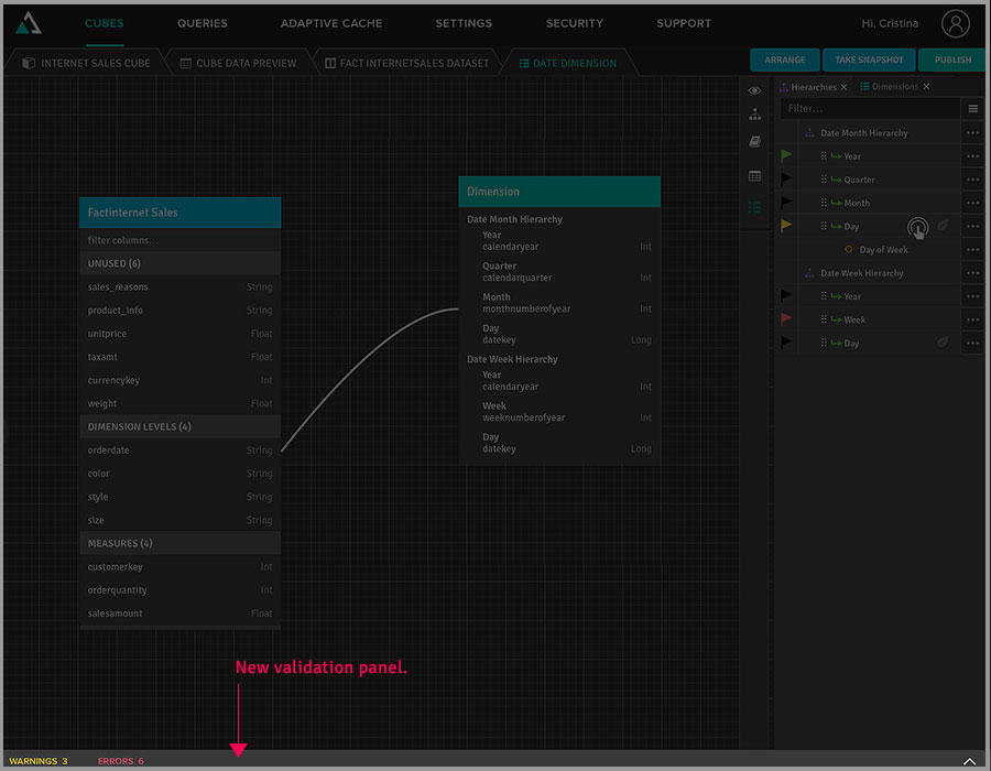
- To address generic notifications that pertain to an entire section, not just a specific object, we introduced a dedicated warnings and errors panel located at the bottom of the screen.
- Color coding and identifying two different types of notifications— “warning” and “errors”—help users distinguish the severity of the alerts.
- Counts for each type of alert were added to provide additional information.
RESULTS
By identifying the types of records customers are looking for earlier in the process, then guiding them through the rest of the flow, the results sets seemed to be more accurate. This was concluded by the up-tick in conversion rates compared to an A/B test that lasted about 3 months after implementation.

MY LOCATION
Silicon Valley, California USA